
A Cartload of Cartography 2: Beyond the Middle Ages
By Tar-Palantir
By Tar-Palantir
Welcome to the second part of this series, on Early Modern maps! You can check the first part, on ancient to medieval maps, out here.

1. Eight leaves of the Catalan Atlas, from 1375.
Once we hit the 15th century, something a bit more like the modern map hoves into view. This is largely driven by advances in seafaring, spearheaded by Portugal and the Catalans. As long-distance voyages became more common, especially ones that involved potentially being out-of-sight of land for a while, actually accurate maps became more important. People could measure latitude pretty well by this point, as the astrolabe began to be replaced by the cross-staff and then the backstaff, making the measurement relatively accurate and simple. However, longitude was still problematic, as its accurate measurement relies on being able to accurately measure time, which was beginning to be resolved on land with better timepieces, but was still impossible at sea, as mechanical devices quickly accumulated error due to the motion of the ship and the excess of water and salt throwing out their delicate mechanisms. The alternative was dead reckoning, where you measure the distance you've sailed on a given bearing to plot your course. This works fairly well in sight of land, where you can correct against known coastal features, but, in the open ocean or along unfamiliar coasts, rapidly becomes inaccurate. Hence, maps from this period tend to look fairly decent in a north-south direction, but get east-west ones often quite wrong – Africa, for instance, usually ends up looking much wider than it actually is.
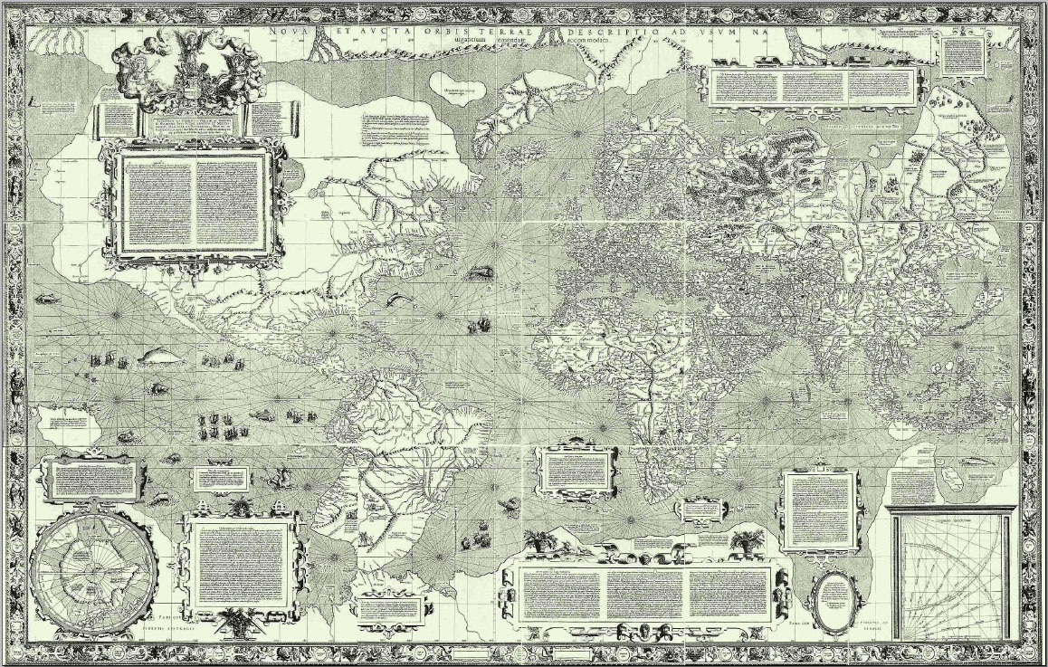
2. Mercator's map, 1569. Public domain via Wikipedia.
The late-14th century Catalan Atlas (Figure 1) is perhaps the most impressive map of this kind - the Mediterranean basin is rendered with a high level of accuracy, but as you move farther afield, this accuracy begins to wane. This map also draws very heavily on the mappa mundi tradition, with various myths and legends depicted in its farther-flung reaches. Most portolan charts were far less elaborate and only showed outlines of coasts with coastal towns and features named.
Portolan charts were produced for a specific purpose for a specific group of people and new ones were usually treated as state secrets, so weren't available to the general public. However, a more enquiring attitude to the world, overseas exploration (primarily for trade at this stage, not empire) and increasing rejection of Catholic dogma, also meant geographical information was more sought after by non-mariners, so we see the first atlases compiled; the very first, titled simply Atlas, including a world map (Figure 2) by Mercator in 1569, marking a shift in European cartographic power to the Netherlands. The work associated with the Netherlandish school of cartography is much closer to what we would think of as maps – they're meant to be repositories of geographic knowledge and, as far as possible, an accurate representation of the world. The culmination of this tradition is perhaps Joan Blaeu's Atlas Maior (Figure 3), published in 9-12 volumes, depending on the edition, between 1662 and 1672. As can be seen in Figures 2 and 3, this school of mapmaking has largely banished the medieval penchant for putting in all kinds of legendary creatures and features, contenting itself with some ships sailing on the sea, explanatory text and decorated borders. Useful bits of cartographic furniture, such as scale bars, also start to make an appearance, in keeping with the changed purpose of these maps.


4. A double hemisphere map, 1666. Boston Public Library.
Remember, though, there were still large parts of the world essentially unknown to European mapmakers at this stage – the interior of Africa and parts of Asia hadn't been nailed down yet. The outline of South America was fairly well-established, though its interior was, likewise, still largely conjectured. North America was less well-outlined, explorers having not yet reached the north-western coast, and the barest outlines of Australia and New Zealand only began to come in during the 17th century. Whilst the overt filling of spaces with legendary figures was no longer practised, mapmakers weren't averse to conjuring up mountains and rivers to fill them in in a slightly more naturalistic manner, so there was still room for invention.
Overall, then, you have a wide choice of map types if you want to set something in this sort of period. You could come up with something pretty medieval-looking overlaid on a somewhat-accurate topography; you could consider a very minimalist portolan chart, or you could move towards a grandly-decorated modern-style map. Think about what would likely to have been driving cartographic progress in your world and how that would affect the evolution of charts – would it be nautically driven, as in our world, or would something else be the main force?